Single Course Layout
Compare the four single course page layouts — Simple, Modern, Minimal, and Immersive — and see how to switch between them.
What is a Single Course Layout?
The Single Course Layout setting controls how a course's single course page is presented to visitors — the arrangement of the hero, description, curriculum, price/enroll area, and other sections. It's a global setting: whichever layout you choose applies to every course's single course page at once, not per course.
Location: Masteriyo → Settings → Single Course Page → Template → Choose Layout. Looking for the layout of the courses list/archive page instead? See Course Settings.
Four layouts are available:
Simple
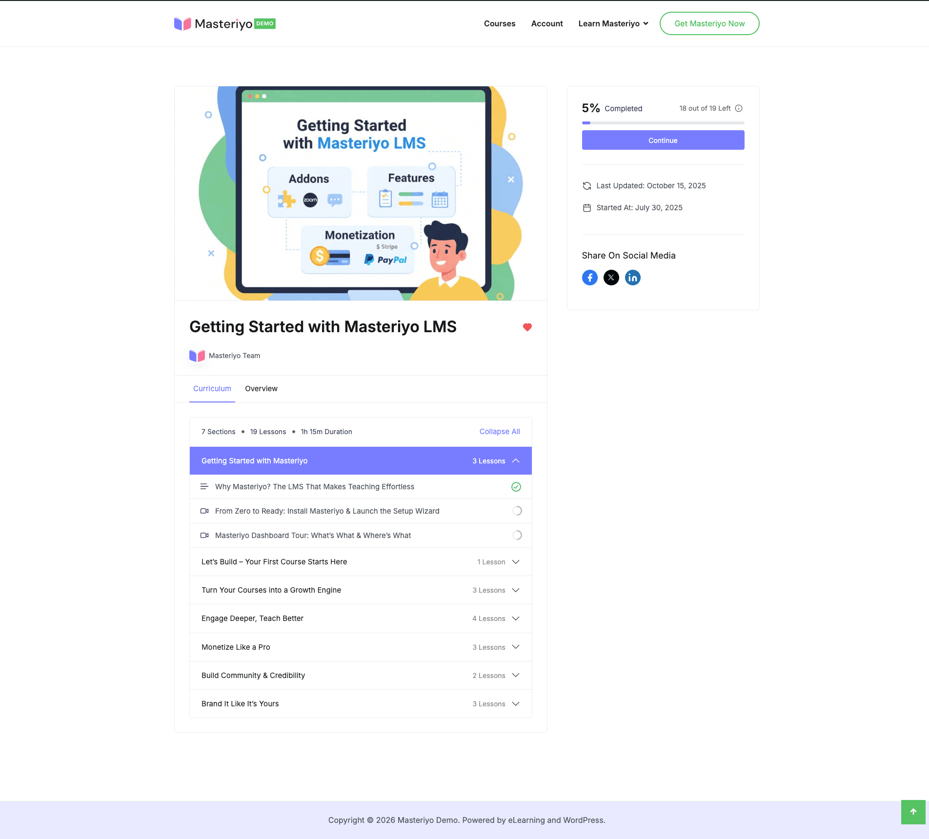
The standard, classic two-column course page: an 8/4 column split with the featured image, categories, title, author/rating, and full course content (curriculum, description, tabs, reviews) in the wide left column, and a sticky sidebar card on the right with price, the enroll button, course stats, and highlights.
Layout Structure
- Main column (left, wide) — featured image, categories, title, author/rating, then the curriculum, description, and reviews
- Sidebar (right, narrow) — price and enroll button, course stats, highlights
The sidebar card sticks in place as visitors scroll through the main column, so price and enroll stay visible.
Modern
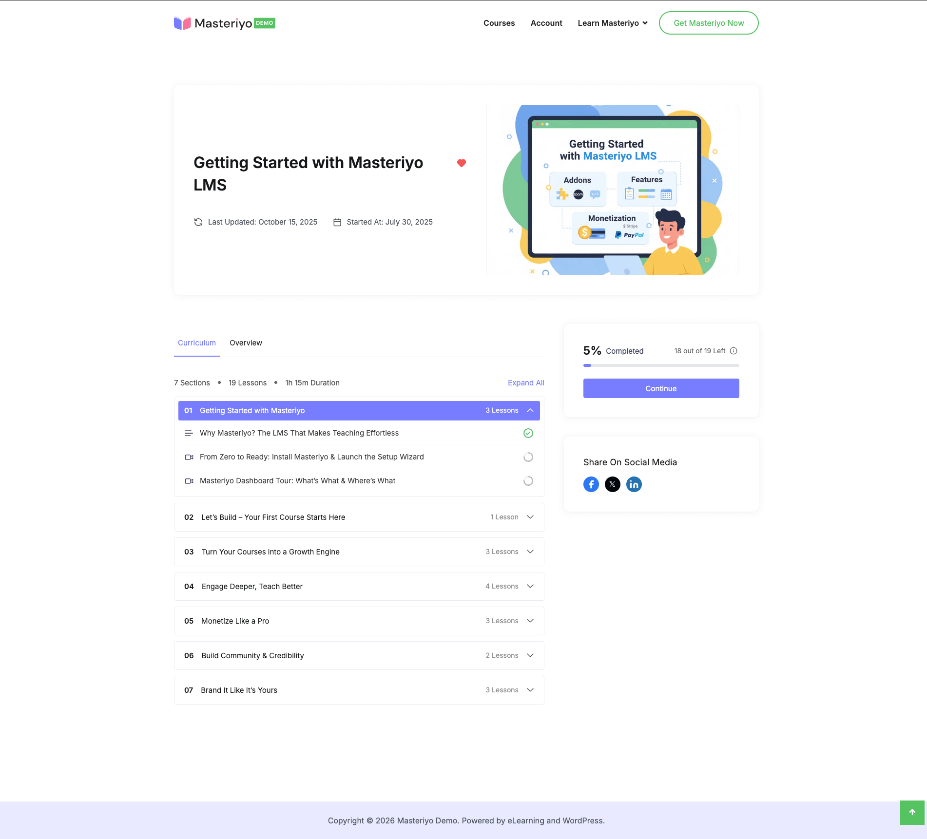
A hero-first layout: a header block spans the full width with the category, title, an author/rating badge row, a meta-info row (duration, students, difficulty, last updated, seats), and the featured image — followed by a two-column body below it. The main content area uses tabs (Overview, Curriculum, Instructor, Reviews) instead of one long scrolling column.
Layout Structure
- Header (full-width) — category, title, author/rating, course meta, featured image
- Body — main content — tabbed sections: Overview, Curriculum, Instructor, Reviews
- Body — sidebar — progress (for enrolled students), price and enroll card, cohort info, expiry countdown, highlights
Like Simple, the price and enroll card in the sidebar is sticky while scrolling the tabbed content.
Minimal
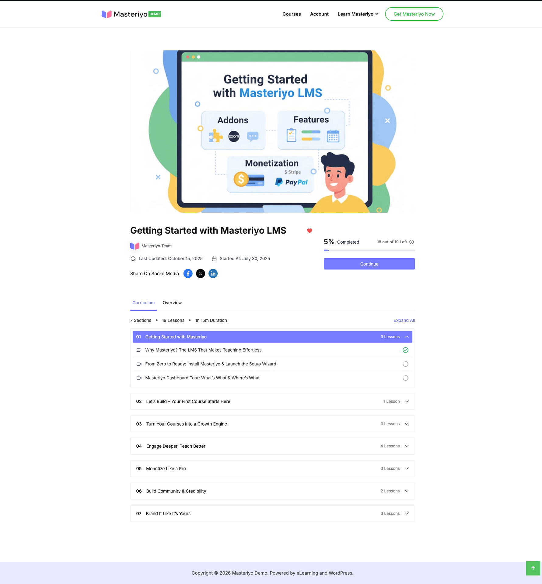
Similar to Simple's two-column body, but with a full-width featured image banner above it, and an additional tabbed content strip appended after the two columns for extra content.
Layout Structure
- Featured image (full-width banner, above everything else)
- Main column (left) — categories, title, badges, expiration info, author/rating, course content
- Sidebar (right) — price and enroll button, course stats, highlights
- Additional tabbed content (full-width, below the two-column body)
The sidebar card is sticky here too, and shows progress-aware states for enrolled students (including a certificate-share option once a course is completed).
Immersive (New)
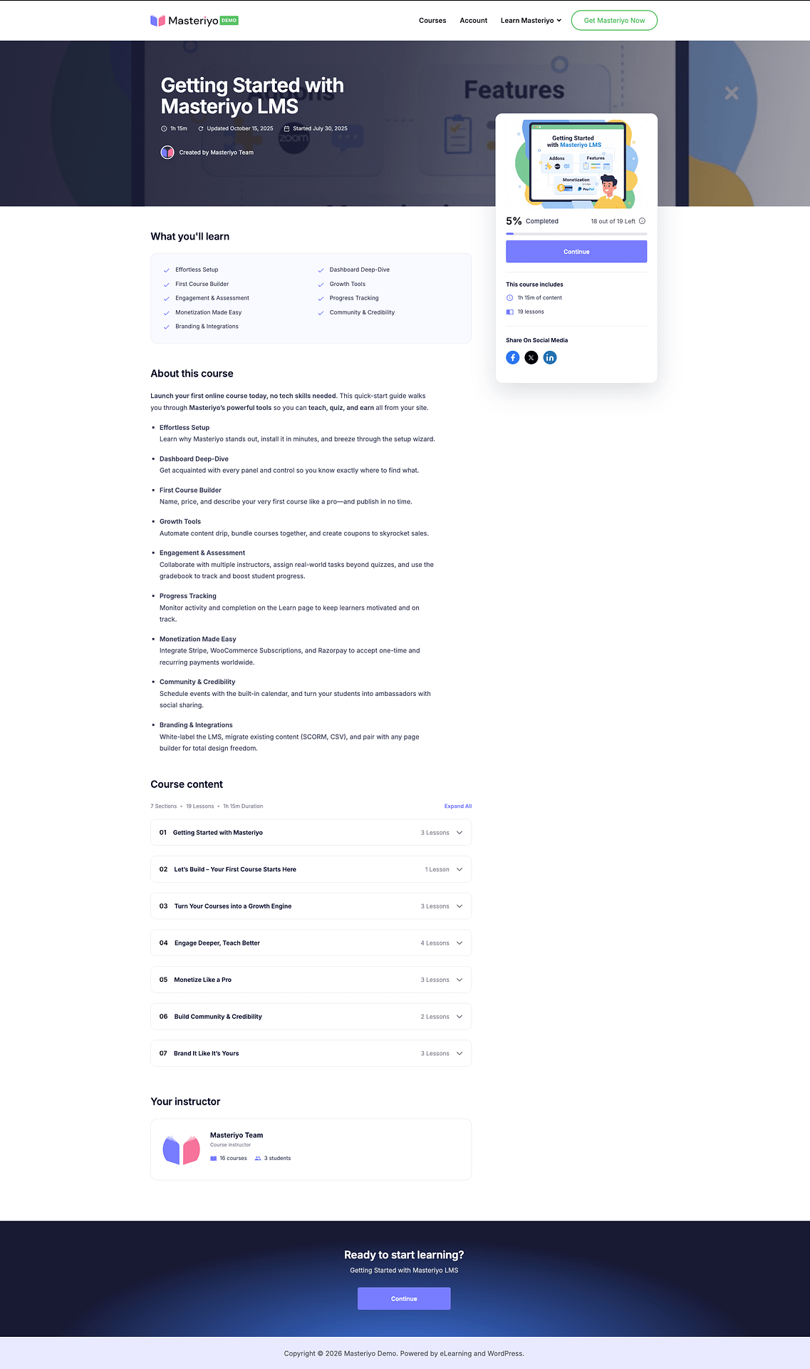
A landing-page style layout: a full-bleed hero band, a sticky floating enroll card, then one continuous scrolling "story" made up of the course's highlights, description, curriculum, instructor bio, and reviews.
Layout Structure
The Immersive page is built as a sequence of full-width sections:
- Hero — a full-bleed background band with the course title, category badges, rating, and author
- Enroll card (sticky, sits alongside the story) — featured media, price, sale badge, the enroll/purchase button, remaining-seats text, and a checklist of what's included
- What you'll learn — the course highlights as a grid
- About this course — the full course description
- Course content — the curriculum, same as other layouts
- Your instructor — bio and stats
- Reviews
- Closing call-to-action
Each section only renders when it has content — a course with no reviews yet, for example, simply skips that section rather than showing an empty block.
The Sticky Enroll Card
The enroll card stays pinned in view as a visitor scrolls through the course story, so the price and enroll button are always reachable.
If the enroll card's own content is taller than the visible viewport (for example, a long "includes" checklist), Masteriyo automatically falls back to normal, non-sticky positioning for that card instead of pinning it in a way that would push content out of reach.
Custom Templates
Additional layout options become available when you activate the Elementor or Bricks page builder addons, or by setting your own template as the active one.
Switching Layouts
- Go to Masteriyo → Settings → Single Course Page
- Open the Template section
- Under Choose Layout, hover any layout thumbnail to see a larger preview
- Select the layout you want
- Click Save Changes
The layout picker shows a static preview image on hover, not a live preview of your own course content.
Frequently Asked Questions
Can I use different layouts for different courses?
No. The Template setting applies site-wide to every course's single course page — there's currently no per-course override.
Do the built-in layouts work with page builder addons like Elementor or Bricks?
Custom page-builder templates are a separate setting from the built-in layouts. If you've set an Elementor or Bricks template as your active single course template, that takes over regardless of which built-in layout (Simple, Modern, Minimal, Immersive) is selected.
Will switching layouts break my existing course content?
No. All four layouts reuse the same course data and rendering hooks (curriculum, price, reviews, etc.) — only the presentation changes.
Is Immersive a paid feature?
No. Immersive is available on Masteriyo Free, the same as the other three layouts.
Was this article helpful to you?
Give us Rating
Last edited on September 08, 2026.
Edit this page